Impressions.
Immerse yourself into an exhibit featuring the impressionist works of artists past and present.
The Process.
The goal of this project was to create an exhibition for people who enjoy impressionist art. Impressions is more than a gallery, it includes a ballroom where people can live as if they are in the era of impressionism, as well as wine for the audience to enjoy while appreciating the art. The exhibition would showcase impressionist artists, past and present, and my scope included deliverables such as t shirts, wine, stationary, and advertisements.
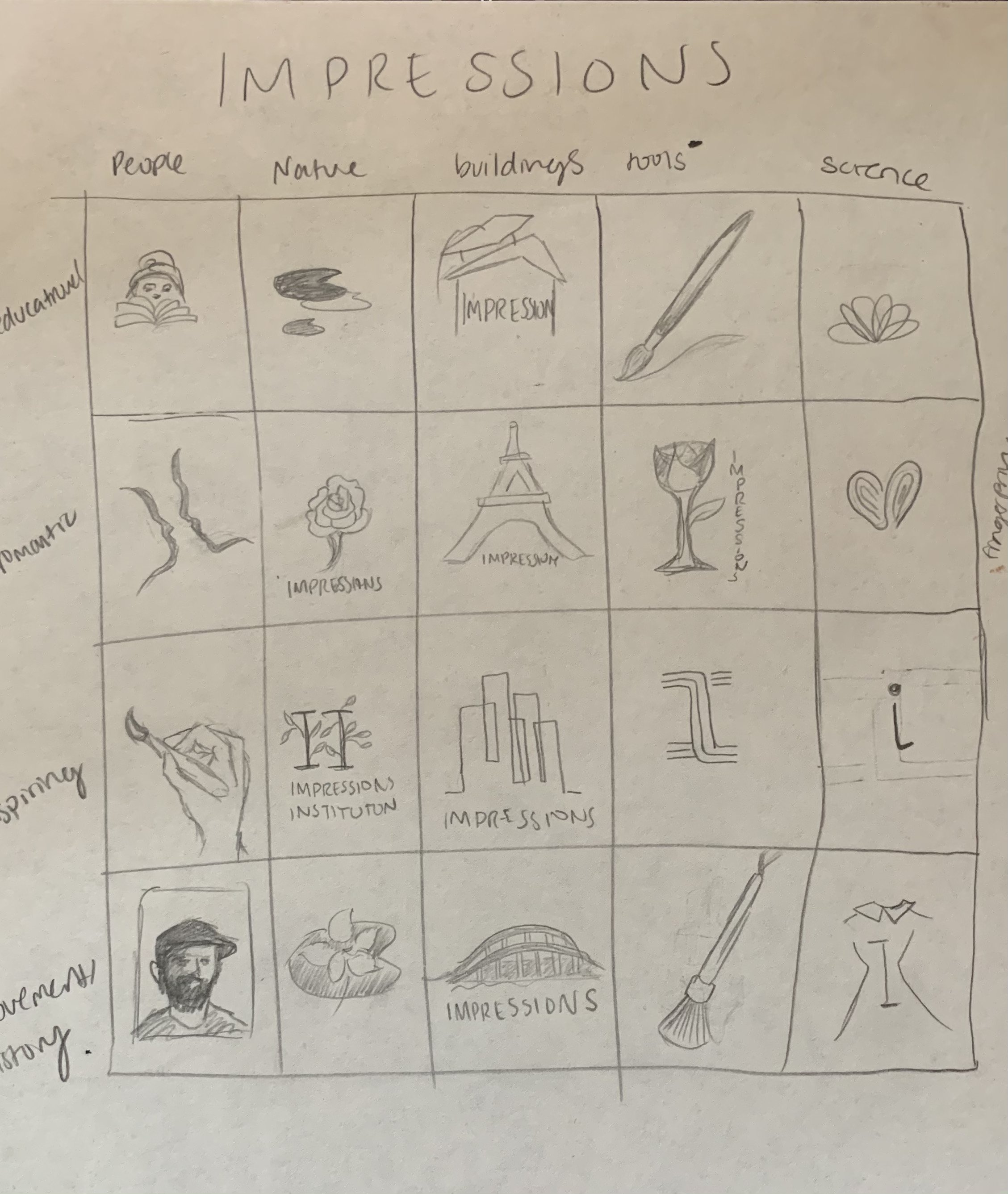
Sketches.
I began sketching the logo early on in the process. I wanted the logo to evoke feelings of shifting times and temporality. I ended up enjoying the look of a flower pieced together with what appear to be paint strokes. In this way, the audience would piece together the ideas of art and time.
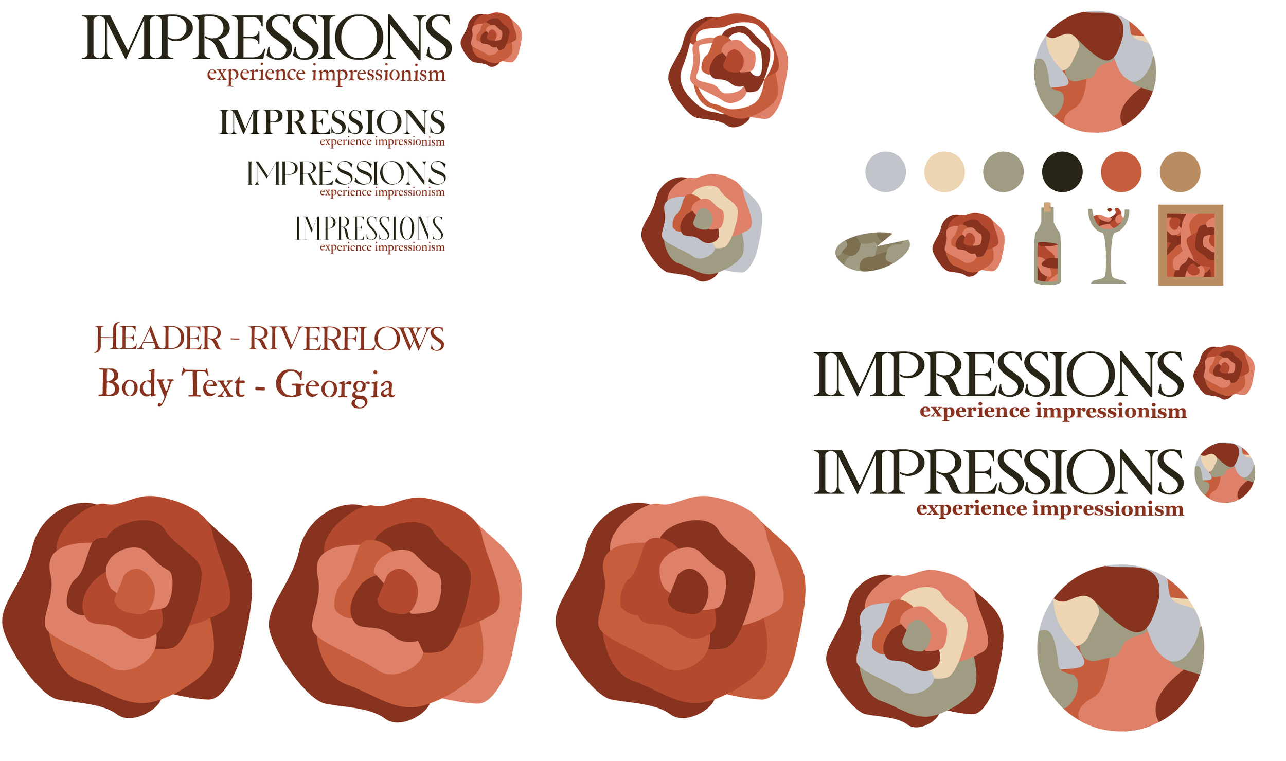
The logo.
Here are my final logo designs along with the typography used. I chose Riverflows for the display font because of the way the characters seem to flow into each other creating the effect of timeliness as well as elegance. I decided on a monochrome logo as it was a more cohesive choice for my project and I created separate imagery that I used throughout my deliverables.
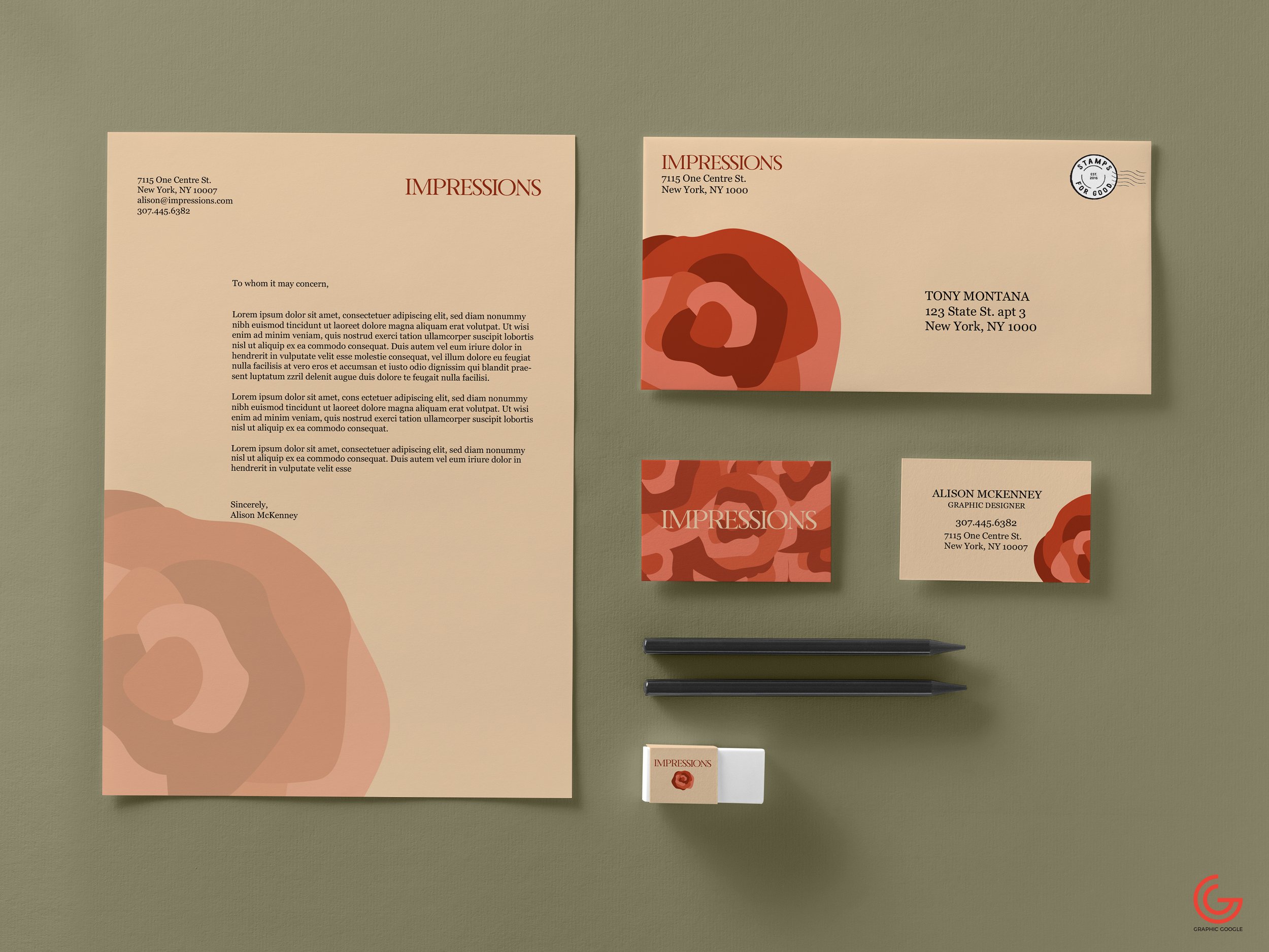
Stationary.
I created stationary for the brand, using muted colors and gold accents on the business cards. I wanted the stationary to appear elegant, cohesive, and artful.

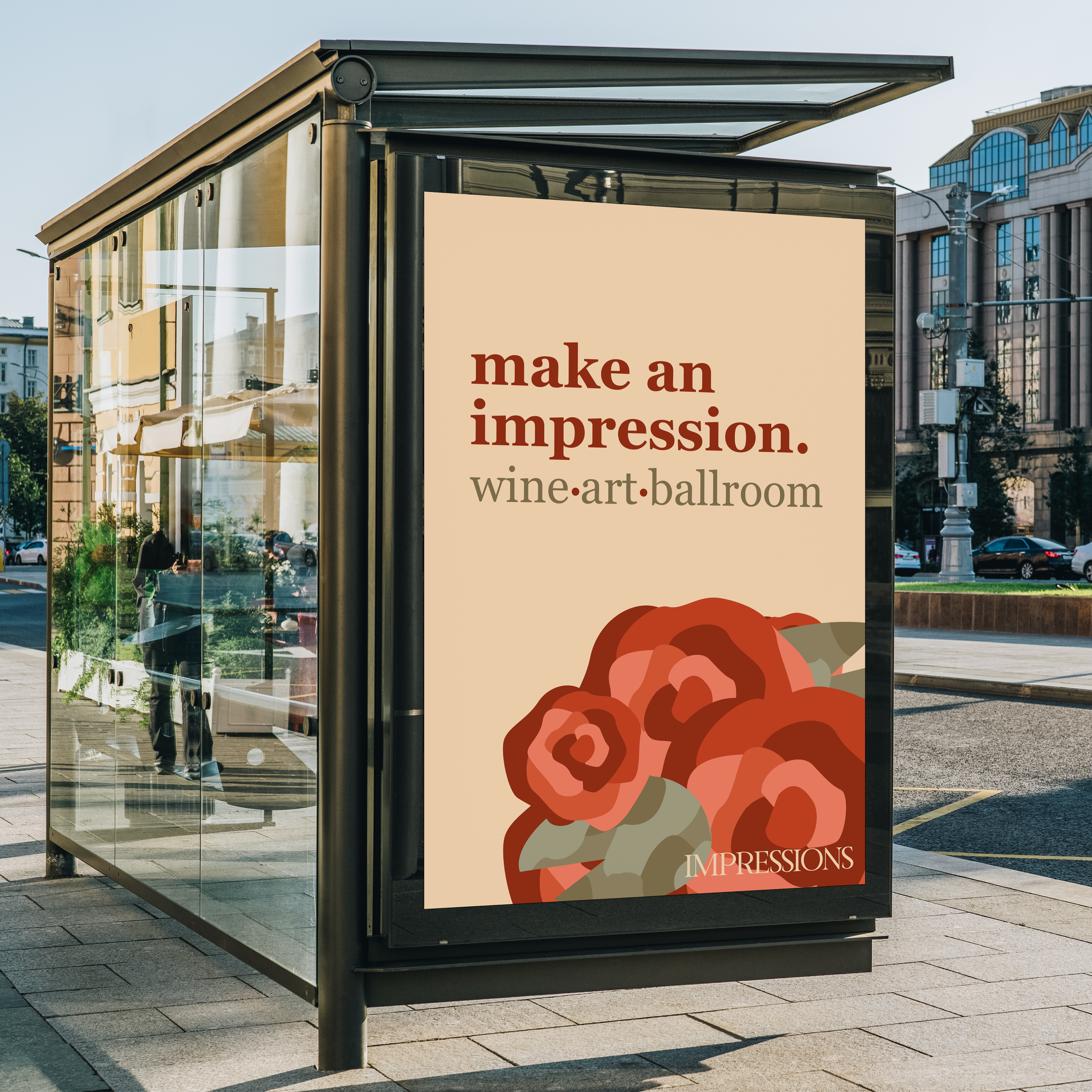
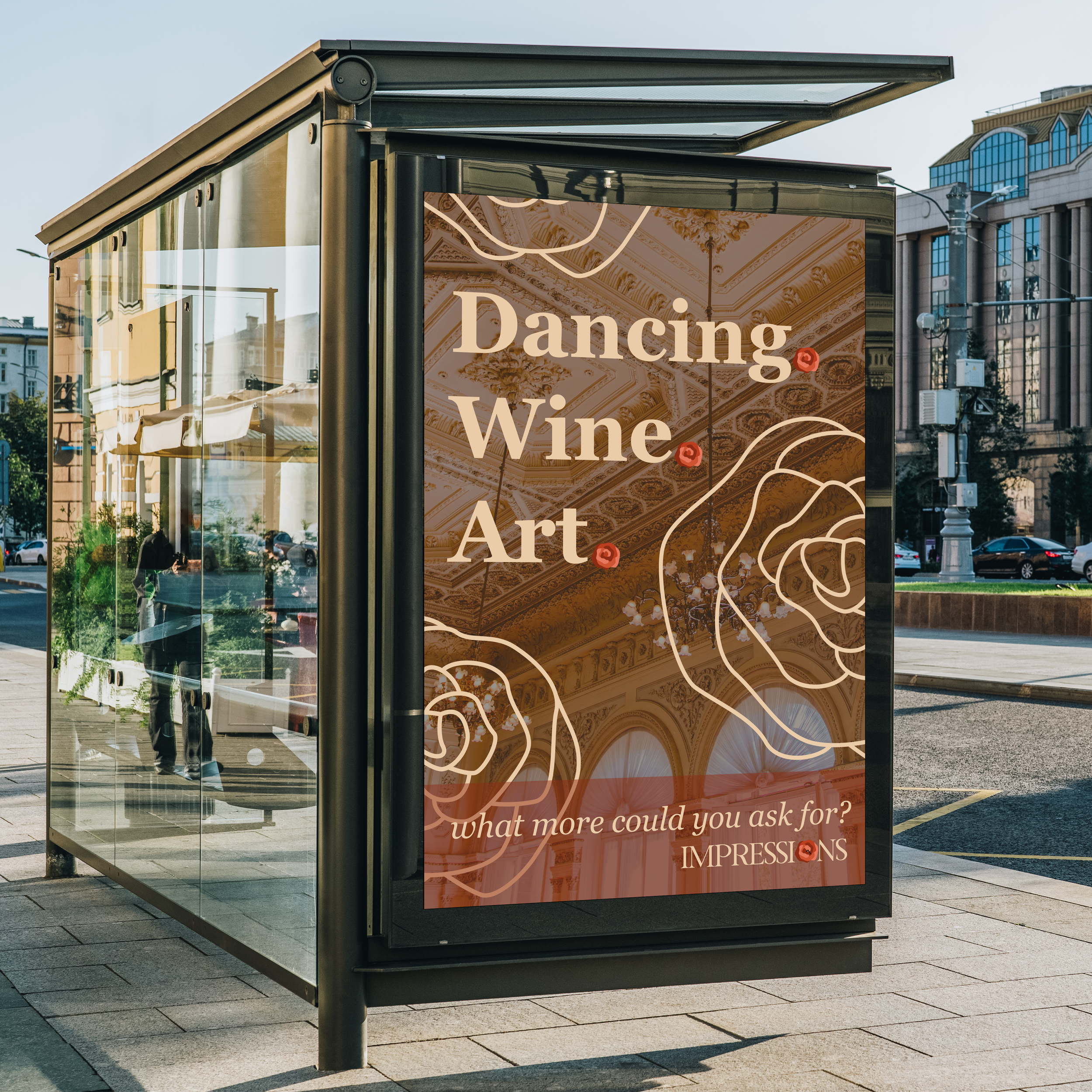
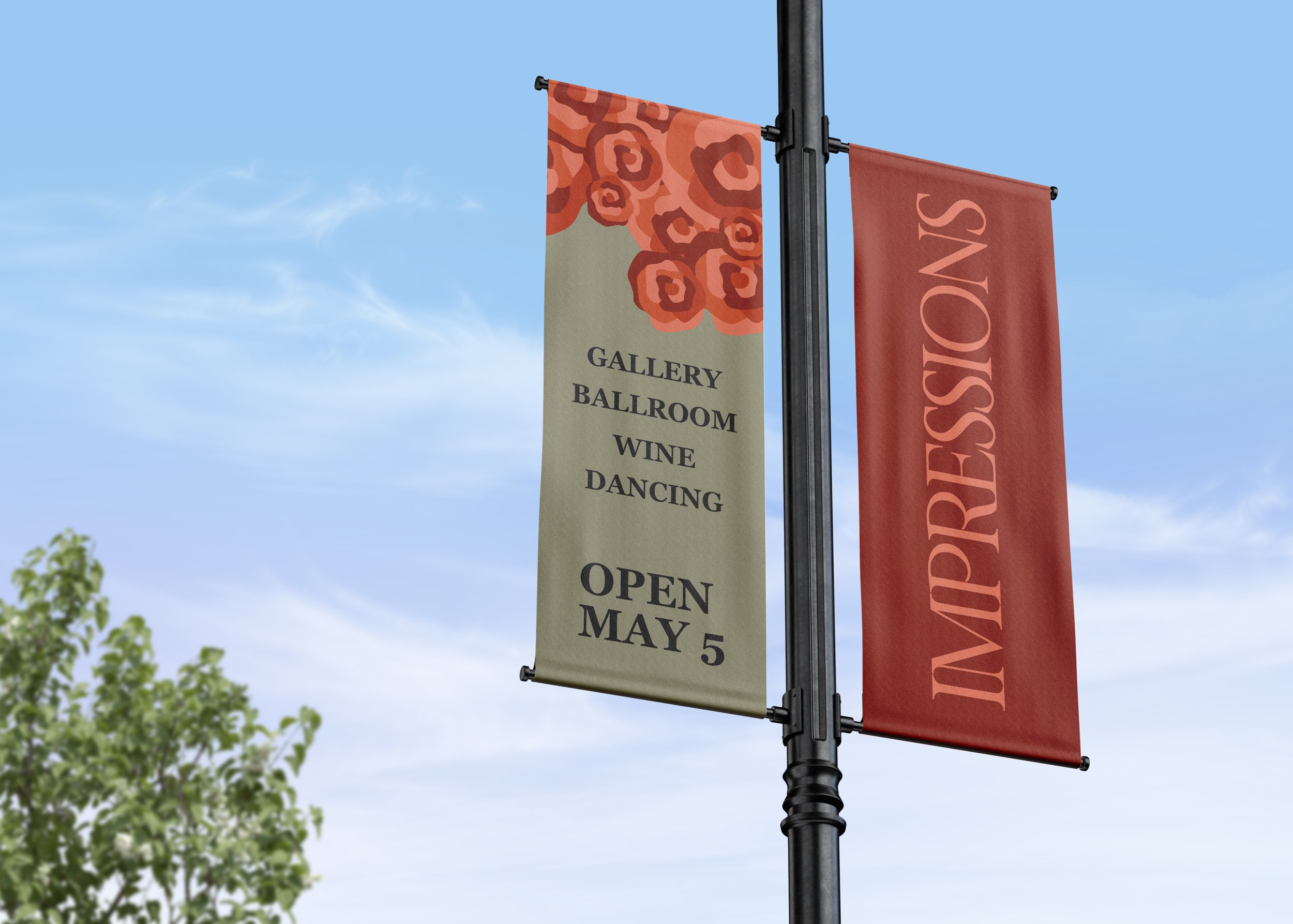
Advertisement.
Since the exhibition is city-based, I used a bus stop to advertise the exhibition.
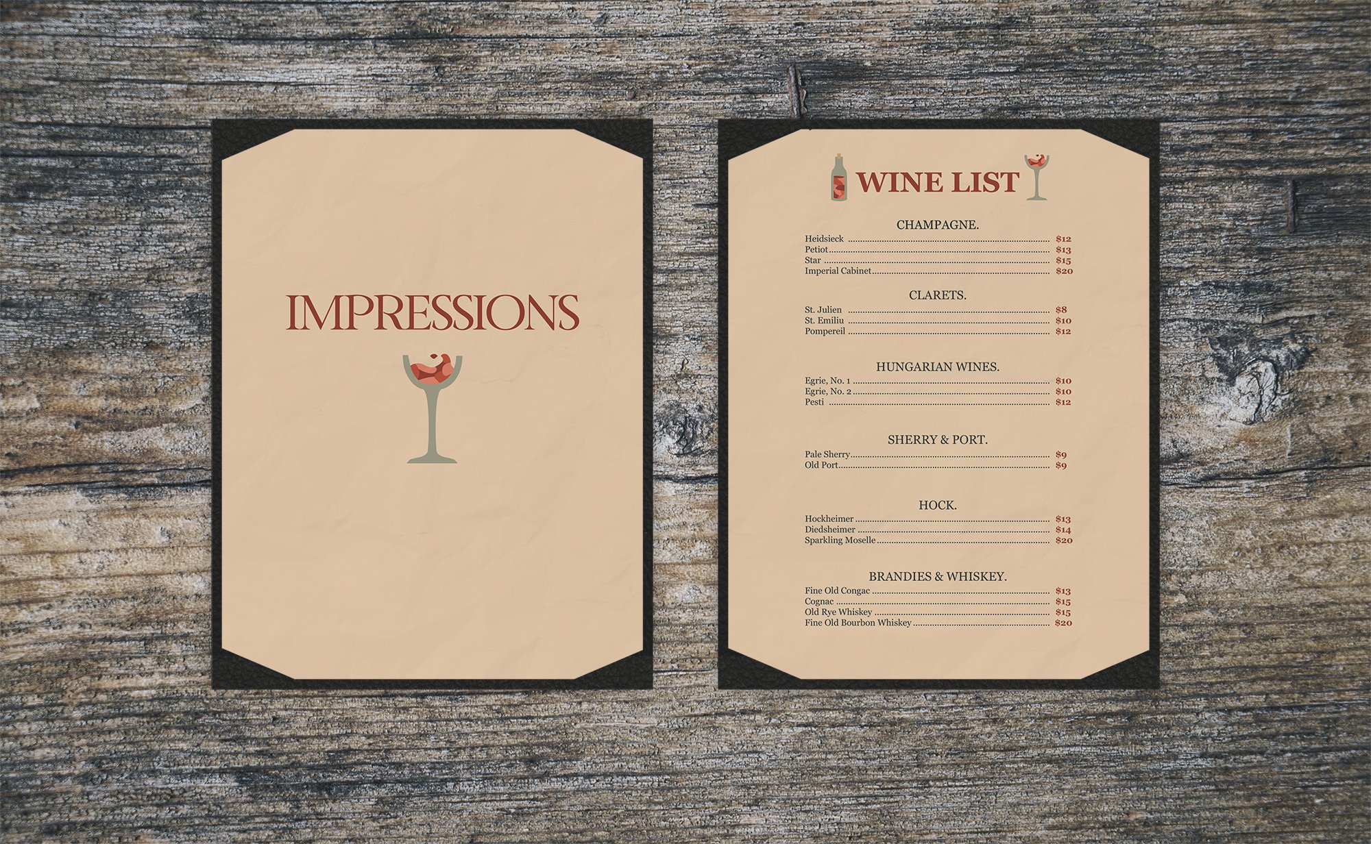
Menu.
Impressions serves wine to its guests to enhance their viewing and dancing experience. I created a simple menu which sells wine and champagne prevalent to the impressionist era time period.

Wine.
I used the design of the logo to create a wine bottle label cohesive with the overall design of the exhibition.

Make it stand out.
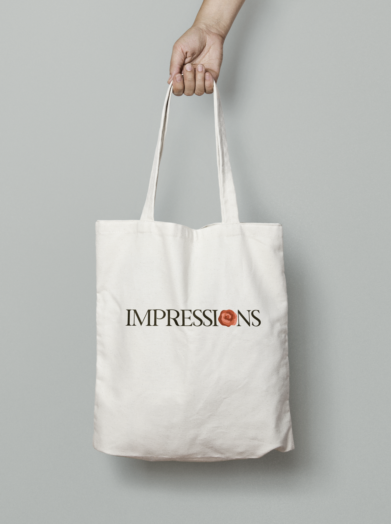
Merch.
I implemented the logo onto t shirts for Impressions guests to purchase.
Final Designs.