
Chicago Jazz Fest
A brochure for Jazz enthusiasts.
The Process.
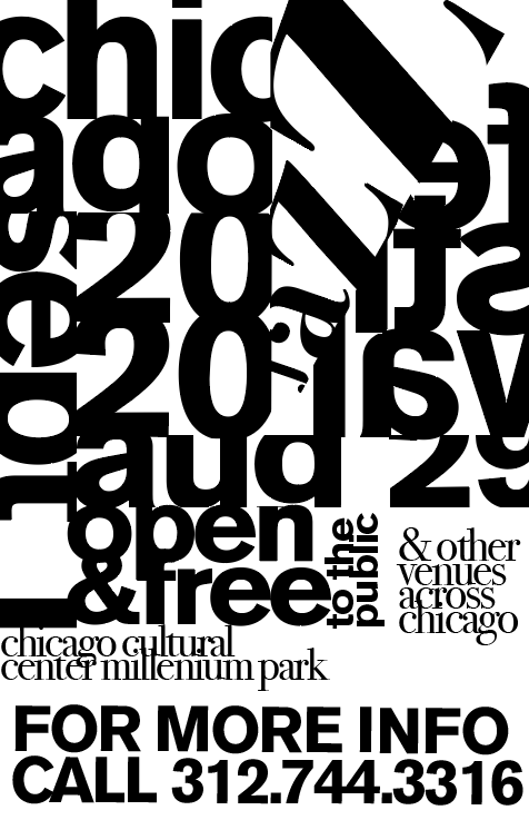
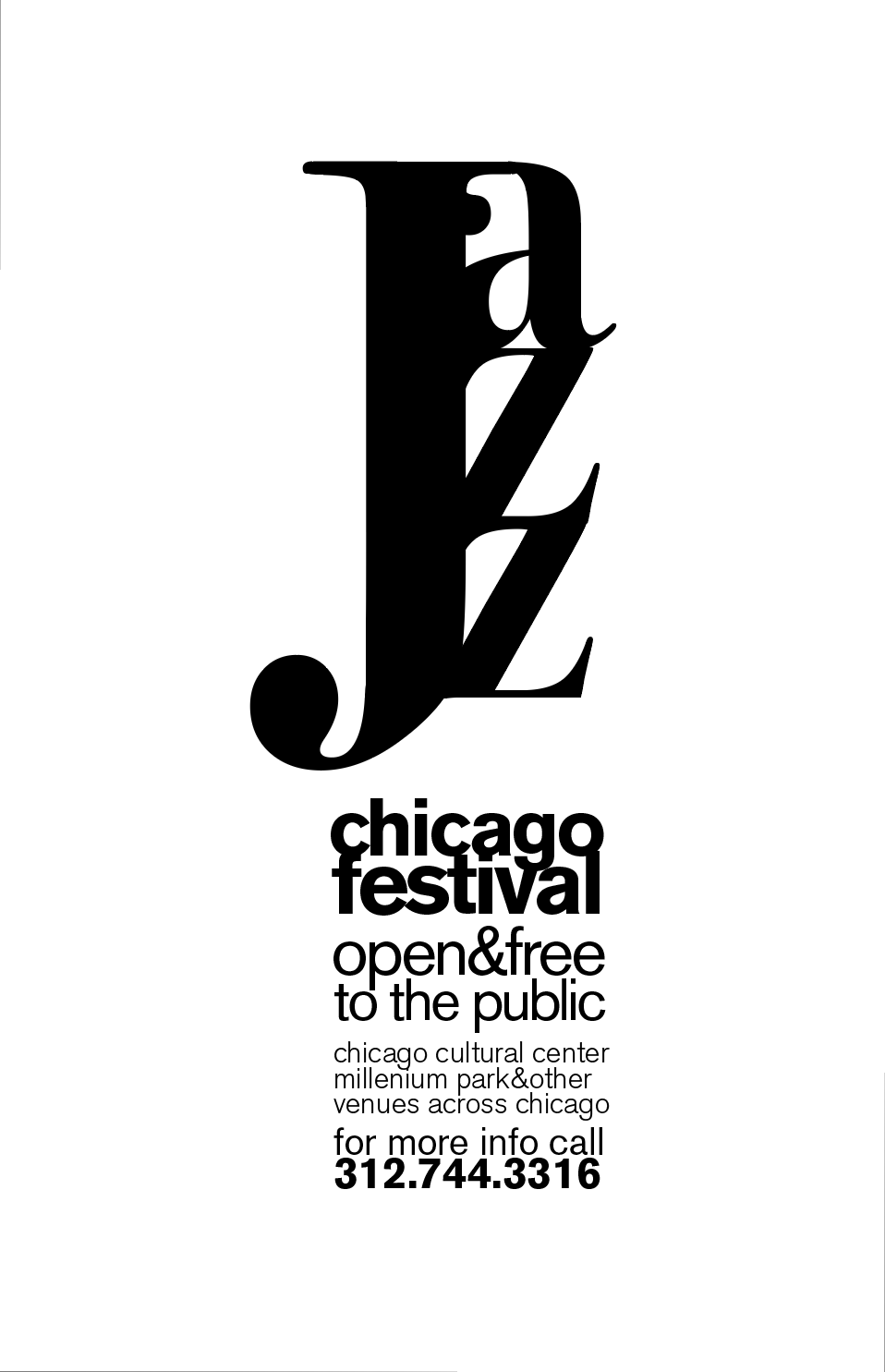
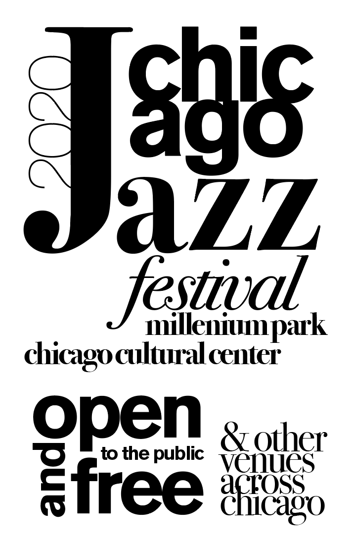
This brochure was created to cater to the jazz community in Chicago. The typography reflects nature of jazz music, chaotic yet cohesive in its full effect.

Sketches.
I began by laying out the information into sketches and explored several design styles and ended up working with a bold sans serif, Helvetica, to represent the staccato beats and bold sounds of brass instruments. I paired it with Minion Pro, a serif font, to resemble the curves of instruments such as a saxophone or tuba.


Color.
I chose my color scheme based on the feeling of vibration that occurs when pairing contrasting colors which resembled the movement of jazz music. I wanted to include red and blue, colors often associated with Chicago, as well as pink orange and green, lively colors found in nature to brighten my pages and add contrast.
